
The Facebook Messenger platform provides great elements that help you tell your story. Probably the most popular one right now is the gallery element with the horizontal scroll. There are interesting examples of chatbots that use this combination of images, titles, and buttons in very creative ways. Talking about design: The Facebook Messenger gallery is in fact the only element where you can actually use visual design to make your chatbot more appealing!
Although the documentation provided by Facebook is great, we always struggled with finding design possibilities and the right image dimensions for the gallery thumbnails. This is why we put together a neat overview for you!
Table of Contents
In this post, we first introduce the generic template for Facebook Messenger, which is the basic element to build a gallery. Afterwards, we provide some great examples that use those carousels in a delightful way. Finally, we put together some thoughts that are important when you want to design thumbnails for galleries.
Facebook Messenger: The Generic Template
The generic template for Facebook Messenger makes it possible to send horizontal scrollable elements, which are also called carousel or gallery elements. It’s one of the only elements that differentiates bot interactions from those between users, who can only send message, links, images, and other document types. You can find the official API reference here.
How Does a Standard Gallery Look Like?
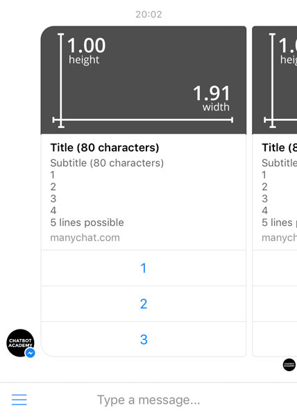
A gallery consists of multiple generic templates, or card items, as they are sometimes called. A card item can contain:
- an image (for dimensions see below)
- a title (up to 80 characters)
- a subtitle (up to 80 characters)
- up to 3 buttons
It is possible to add up to 10 items to a gallery in Facebook Messenger.
Ideas For Mixing Gallery Items
Not every element of the generic template is required (only the title is), but you need to have at least two elements in every card item to send a gallery. In fact, sometimes it doesn’t even make sense to use all of the fields. Besides the required title, it might be a good idea to experiment with different types of combinations:
- Image + very long, explanatory title
- Title + button with call-to-action
- Image + title + link
For example, when explaining the bot’s functionality, you might just need a few images + titles to make people understand what’s going on. With our second iteration of EmojiNews, we did exactly that:
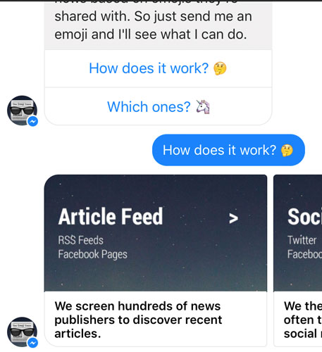
Especially since the the introduction of quick replies, it is no longer necessary to add buttons to every item.
What To Consider When Designing Galleries
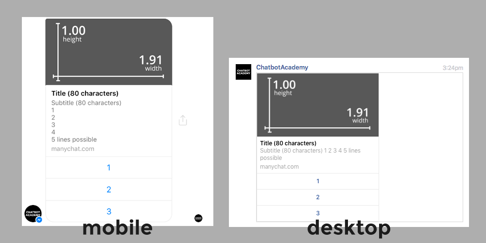
The Facebook Messenger platform is pretty new and therefore quickly changing, which is great! Unfortunately, this also means that there are still some inconsistencies, if you view it on different platforms.
For example, if you’re planning to spread the subtitle across different lines, be careful. It doesn’t always look the same:
Facebook Messenger Gallery: Notable Examples
We think the images inside gallery elements are a great opportunity to design delightful and easily snackable content. However, we believe this feature isn’t used as excessively as it should be. To encourage you to keep going and experiment with different types of gallery images, here are some examples:
Wall Street Journal
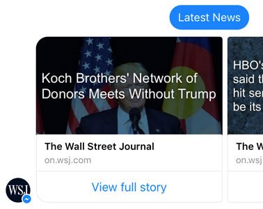
The WSJ makes use of text on their thumbnails to provide news consumers with easily snackable titles. The downside: alignment doesn’t really go well with the title and url in the card.
We reviewed the chatbot here: Chatbot Studies: WSJ for Facebook Messenger.
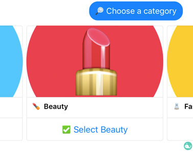
Swelly
This “A or B” decision bot is very well designed. The colorful thumbnails, the emoji titles, and the checkmark button make great use of the gallery element.
We’re going to add a chatbot UX study soon. Until then, you can message Swelly here.
More Examples: To Be Updated
Any more chatbots that have great gallery images that should be featured? Please let us know in the comments below. 👍
Thumbnail Design Guidelines
In this section, we will have a closer look at how to design great visual gallery elements with the use of thumbnails. Note that the Facebook Messenger platform is very much at the beginning and design best practices have yet to emerge. This is why we’re going to constantly update this guide.
Gallery Thumbnail Image Dimensions
According to the Facebook Developers Guidelines (see full documentation), the gallery image ratio is 1.91:1. Since there are many different devices that work with Facebook Messenger, there is no single truth for thumbnail dimensions.
Here’s what we know so far:
- maximum dimensions on desktop: 500px : 260px
- landscape dimensions on an iPhone 6: about 780px : 410px (from a screenshot)
Which is weird: The dimensions don’t really add up with the image ratio from Facebook. Here are some considerations to deal with this problem:
Some Thumbnail Design Ideas
- Prioritize image file size: many people have slow mobile Internet, images that don’t load hurt your UX. Thus, don’t make it too big so that it’s optimized for an iPhone 6+ in landscape mode (because, who uses their Messenger in landscape?). Maybe start with 300px height (we’re looking into this right now) and see how it looks like
- In case of doubt, go with centered elements: Left-aligned text doesn’t work well on different devices (see WSJ example above). Until we provide you with a template (we will, stay tuned!), it might be a good idea to try centered elements that catch the readers’ attention and don’t distract due to alignment issues
- Be playful: Work with colors, emojis, be bold. Now is the time to experiment with chatbots.
Now It’s Your Turn
Anything we should add? Please tell us if we missed something! We’re still exploring this whole chatbot design thing and think it’s an amazing field that needs more attention. Very interested in your comments below. 🤖
Header photo by Jessica Ruscello, emojis by EmojiOne!
